Understanding the Impact of Brand Colors takes center stage, drawing you into a world where colors shape perceptions and drive decisions. Get ready to explore the fascinating realm of branding and psychology intertwined with hues and shades.
From the importance of brand colors to the psychology behind them, this topic delves into how color choices can make or break a brand’s identity. Let’s uncover the secrets behind the colors that define our favorite brands.
Importance of Brand Colors
Brand colors play a crucial role in creating a strong brand identity. They help companies stand out in a crowded marketplace, differentiate themselves from competitors, and leave a lasting impression on consumers.
Examples of Well-Known Brands
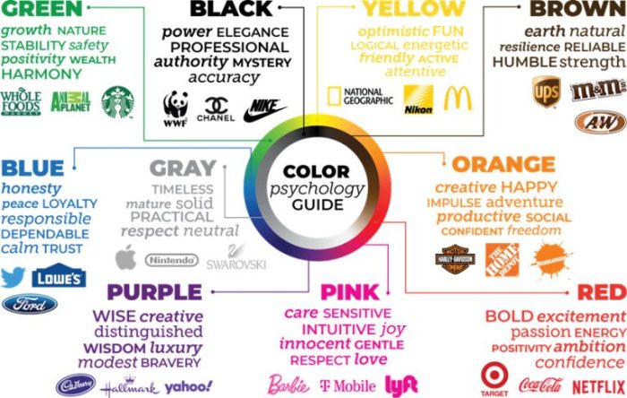
- One classic example is Coca-Cola, which uses red as its primary brand color. The bold red color evokes feelings of energy, excitement, and passion, which align perfectly with the brand’s image.
- Another example is Starbucks, known for its iconic green logo. The calming green color is associated with nature, growth, and freshness, reflecting the brand’s commitment to quality and sustainability.
- McDonald’s is instantly recognizable by its vibrant yellow and red color scheme. These colors are often used to stimulate appetite and create a sense of urgency, driving consumers to make quick purchasing decisions.
Emotions and Purchasing Decisions
Brand colors can evoke specific emotions in consumers, influencing their purchasing decisions. For example, blue is often used to convey trust, reliability, and professionalism, making it a popular choice for financial institutions and tech companies. On the other hand, orange is associated with creativity, enthusiasm, and youthfulness, making it a common choice for brands targeting a younger audience.
Psychology of Colors: Understanding The Impact Of Brand Colors

The psychology of colors plays a crucial role in how consumers perceive and interact with brands. Different colors have the power to evoke specific emotions and influence behavior in various ways. Understanding the impact of color psychology can help businesses create effective branding strategies that resonate with their target audience.
Color Symbolism and Meaning
- Red: Often associated with passion, energy, and urgency. It can create a sense of excitement and stimulate appetite, commonly used by food and beverage brands.
- Blue: Symbolizes trust, reliability, and professionalism. It is often used by tech companies and financial institutions to convey security and stability.
- Yellow: Represents optimism, warmth, and creativity. It can grab attention and create a sense of happiness, commonly used by brands targeting a youthful audience.
Cultural Influence on Color Perception
- Colors can have different meanings and associations across cultures. For example, white symbolizes purity and innocence in Western cultures but represents mourning in some Eastern cultures.
- It is essential for brands to consider cultural differences in color perception when expanding globally to ensure their branding resonates positively with diverse audiences.
Color Theory in Branding

When it comes to branding, color theory plays a crucial role in creating a visual identity that resonates with the target audience. By understanding the basics of color theory and how different colors evoke specific emotions and associations, businesses can effectively communicate their brand message.
Color Combinations in Branding
Color combinations are key in creating visually appealing brand designs. Whether using complementary colors that are opposite on the color wheel to create contrast, or analogous colors that are next to each other for a harmonious look, choosing the right color combinations can make a significant impact on how a brand is perceived.
- Complementary Colors: Using colors that are opposite on the color wheel, such as blue and orange, can create a vibrant and eye-catching design that stands out.
- Analogous Colors: Colors that are next to each other on the color wheel, like green and yellow, can create a cohesive and calming feel for a brand.
- Tips for Choosing Colors: Consider the brand’s personality and values when selecting colors. For example, a bold and energetic brand may opt for bright and contrasting colors, while a more sophisticated brand may choose a more muted and harmonious color palette.
Brand Color Case Studies
In the competitive world of branding, the strategic use of colors can make or break a company’s identity. Let’s dive into some case studies to see how successful brands have leveraged their color choices to communicate effectively with their target audience.
Apple vs. Samsung: Blue vs. Green
When we think of tech giants Apple and Samsung, we immediately associate them with their brand colors – blue and green, respectively. Apple’s use of blue conveys trust, reliability, and innovation, while Samsung’s green represents growth, harmony, and balance. Despite both companies operating in the same industry, their color choices help differentiate them and communicate their unique brand values to consumers.
- Apple’s sleek and minimalist packaging, website, and product design consistently feature shades of blue, creating a sense of sophistication and cutting-edge technology.
- On the other hand, Samsung’s green color palette is reflected in their eco-friendly initiatives, marketing materials, and product aesthetics, reinforcing their commitment to sustainability and environmental consciousness.
Color consistency across different touchpoints is crucial for brand recognition and establishing a strong brand identity in the minds of consumers.
McDonald’s: The Power of Red and Yellow, Understanding the Impact of Brand Colors
One of the most recognizable fast-food brands, McDonald’s strategically uses the combination of red and yellow in its branding to evoke feelings of excitement, energy, and warmth. The bright red color stimulates appetite and creates a sense of urgency, while the vibrant yellow communicates happiness, positivity, and friendliness.
- McDonald’s iconic golden arches logo, along with their red and yellow packaging, signage, and uniforms, create a cohesive brand experience that is instantly associated with the fast-food chain.
- The color scheme of red and yellow is consistently applied across all McDonald’s locations worldwide, reinforcing brand recognition and creating a sense of familiarity for customers.


